
The kit
Elements [18]
EK Image Scroller
Timed animation
Reduced-motion aware
Image Scroller
Shows a fixed-size frame that automatically scrolls across a larger image vertically, horizontally, or on both axes, triggered by hover or by entering the viewport.
Dynamic Data
Source image and link URL
Triggers
Hover or viewport entry
Touch
One-time viewport scroll
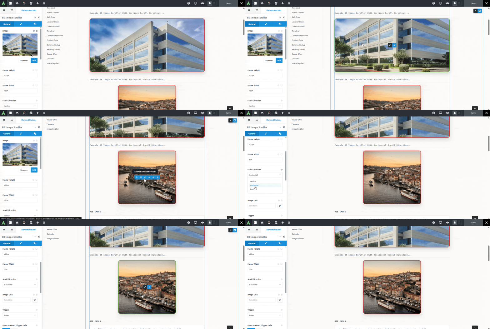
The frame stays fixed while the image travels.
Example of image scroller with vertical scroll direction…
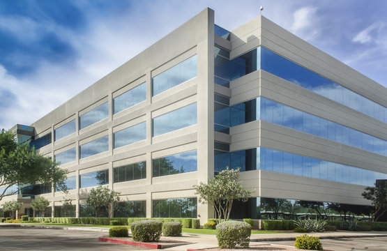
Example of image scroller with horizontal scroll direction…
Use cases
Key features
What the element does, in plain terms. Every individual control is listed in the settings reference below.
Motion
Scroll directions
Vertical, which is the default, horizontal, or both axes at once.
Triggers
Hover by default, or when the frame enters the viewport, with an optional reverse on mouse leave.
Timing
Duration, easing curve, and start delay controls.
Touch fallback
A one-time viewport-triggered scroll on touch devices, where hover is unavailable.
Reduced motion
A static crop at the start position with no animation.
Frame
Responsive frame
Configurable height and width per breakpoint, plus border, border radius, and box shadow.
Optional link
The whole frame can wrap an accessible link to a URL or a Dynamic Data destination.
Responsive outer spacing
Margin and padding per breakpoint.
Settings reference
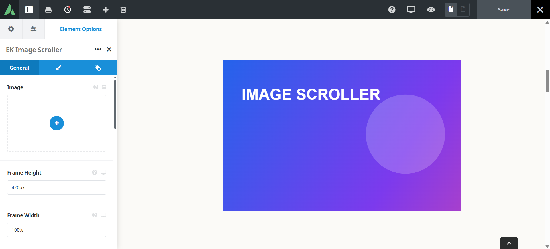
Every setting the element exposes, grouped by builder tab. Options are listed where the setting offers a fixed set of choices.
Image and motion General tab
Source image
Dynamic Data
The larger image revealed through the frame. Alt text comes from the WordPress attachment metadata.
Scroll direction
Vertical · Horizontal · Both
Which way the image travels. If the image is not larger than the frame in that direction, nothing moves.
Trigger
Hover · In viewport
Hover starts the motion on pointer entry. In viewport starts it when the frame scrolls into view, which also covers touch devices.
Reverse on mouse leave
On · Off
Returns the image to its start position when the pointer leaves, rather than holding the end crop.
Duration
How long the full travel takes. Slower motion reads as deliberate rather than restless.
Easing
The speed curve of the travel, from linear to eased.
Start delay
A pause before motion begins after the trigger fires.
Frame Design tab
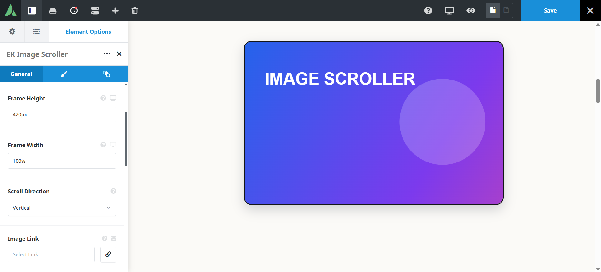
Frame height
Per breakpoint
The visible height of the frame at each breakpoint, which sets how much of a tall image is shown at once.
Frame width
Per breakpoint
The visible width of the frame at each breakpoint.
Border
Border width, style, and colour around the frame.
Border radius
Corner rounding of the frame.
Box shadow
An optional shadow, which helps the frame read as a window onto a larger image.
Link URL
Dynamic Data
Wraps the frame in an accessible link to this destination.
Margin
Per breakpoint
Outer spacing around the element, set separately for large, medium, and small screens and scoped to this element instance.
Padding
Per breakpoint
Inner spacing between the element container edge and its content, also set per breakpoint.
Extras Extras tab
Conditional Rendering
Avada logic conditions
Shows or hides the element based on logged-in state, user role, and the other conditions Avada’s logic system offers.
On this page
