
The kit
Elements [18]
EK Advanced Table
Live inline editing
Advanced Table
Paste or visually edit spreadsheet-style data into a feature-rich HTML table with sorting, search, pagination, and responsive column behaviour.
Dynamic Data
Not available on cell content
Row limit
500 rows per instance
Live Builder
Tier 3 inline editing
Minimal editorial
| Item | Category | Status | Amount |
|---|---|---|---|
| Atlas | Platform | Active | $12,400 |
| Beacon | Infra | Pending | $8,150 |
| Cascade | Design | Active | $21,900 |
| Delta | Research | Complete | $5,300 |
| Ember | Platform | Pending | $3,780 |
| Flux | Infra | Active | $14,620 |
Highlighted row
| Item | Category | Status | Amount |
|---|---|---|---|
| Atlas | Platform | Active | $12,400 |
| Beacon | Infra | Pending | $8,150 |
| Cascade Featured | Design | Active | $21,900 |
| Delta | Research | Complete | $5,300 |
| Ember | Platform | Pending | $3,780 |
| Flux | Infra | Active | $14,620 |
Highlighted column
| Item | Category | Status | Amount |
|---|---|---|---|
| Atlas | Platform | Active | $12,400 |
| Beacon | Infra | Pending | $8,150 |
| Cascade | Design | Active | $21,900 |
| Delta | Research | Complete | $5,300 |
| Ember | Platform | Pending | $3,780 |
| Flux | Infra | Active | $14,620 |
Card & zebra
| Item | Category | Status | Amount |
|---|---|---|---|
| Atlas | Platform | Active | $12,400 |
| Beacon | Infra | Pending | $8,150 |
| Cascade | Design | Active | $21,900 |
| Delta | Research | Complete | $5,300 |
| Ember | Platform | Pending | $3,780 |
| Flux | Infra | Active | $14,620 |
Dark mode
| Item | Category | Status | Amount |
|---|---|---|---|
| Atlas | Platform | Active | $12,400 |
| Beacon | Infra | Pending | $8,150 |
| Cascade | Design | Active | $21,900 |
| Delta | Research | Complete | $5,300 |
| Ember | Platform | Pending | $3,780 |
| Flux | Infra | Active | $14,620 |
A long specification table with search, sorting, and a sticky header row.
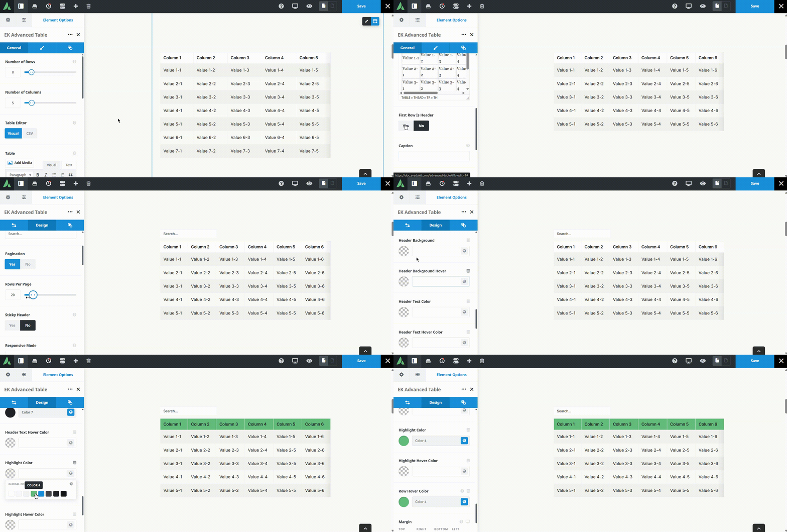
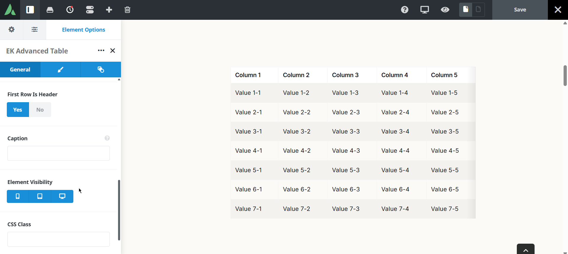
Example of advanced table with first row is header…
| Column 1 | Column 2 | Column 3 | Column 4 | Column 5 |
|---|---|---|---|---|
| Value 1-1 | Value 1-2 | Value 1-3 | Value 1-4 | Value 1-5 |
| Value 2-1 | Value 2-2 | Value 2-3 | Value 2-4 | Value 2-5 |
| Value 3-1 | Value 3-2 | Value 3-3 | Value 3-4 | Value 3-5 |
| Value 4-1 | Value 4-2 | Value 4-3 | Value 4-4 | Value 4-5 |
| Value 5-1 | Value 5-2 | Value 5-3 | Value 5-4 | Value 5-5 |
| Value 6-1 | Value 6-2 | Value 6-3 | Value 6-4 | Value 6-5 |
| Value 7-1 | Value 7-2 | Value 7-3 | Value 7-4 | Value 7-5 |
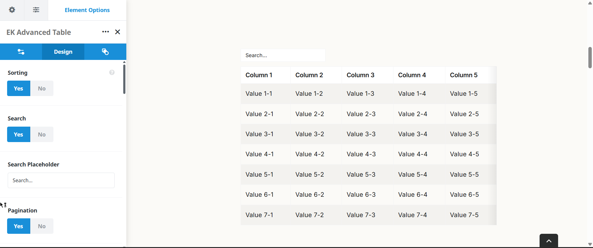
Example of advanced table with sorting, search and pagination…
| Column 1 | Column 2 | Column 3 | Column 4 | Column 5 |
|---|---|---|---|---|
| Value 1-1 | Value 1-2 | Value 1-3 | Value 1-4 | $12,400 |
| Value 2-1 | Value 2-2 | Value 2-3 | Value 2-4 | Value 2-5 |
| Value 3-1 | Value 3-2 | Value 3-3 | Value 3-4 | Value 3-5 |
| Value 4-1 | Value 4-2 | Value 4-3 | Value 4-4 | Value 4-5 |
| Value 5-1 | Value 5-2 | Value 5-3 | Value 5-4 | Value 5-5 |
| Value 6-1 | Value 6-2 | Value 6-3 | Value 6-4 | Value 6-5 |
| Value 7-1 | Value 7-2 | Value 7-3 | Value 7-4 | Value 7-5 |
| Value 8-1 | Value 8-2 | Value 8-3 | Value 8-4 | Value 8-5 |
Example of advanced table with sticky header, zebra Striping and row hover…
| Column 1 | Column 2 | Column 3 | Column 4 | Column 5 |
|---|---|---|---|---|
| Value 1-1 | Value 1-2 | Value 1-3 | Value 1-4 | Value 1-5 |
| Value 2-1 | Value 2-2 | Value 2-3 | Value 2-4 | Value 2-5 |
| Value 3-1 | Value 3-2 | Value 3-3 | Value 3-4 | Value 3-5 |
| Value 4-1 | Value 4-2 | Value 4-3 | Value 4-4 | Value 4-5 |
| Value 5-1 | Value 5-2 | Value 5-3 | Value 5-4 | Value 5-5 |
| Value 6-1 | Value 6-2 | Value 6-3 | Value 6-4 | Value 6-5 |
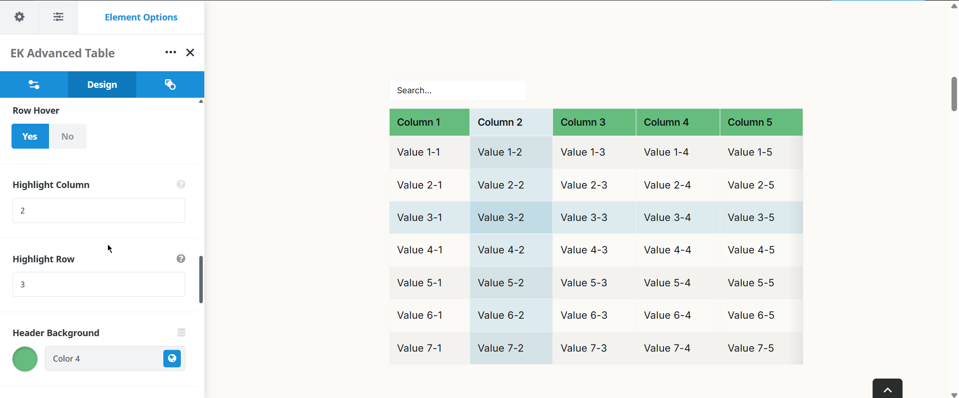
Example of advanced table with Highlight Column and Highlight row…
| Column 1 | Column 2 | Column 3 | Column 4 | Column 5 |
|---|---|---|---|---|
| Value 1-1 | Value 1-2 | Value 1-3 | Value 1-4 | Value 1-5 |
| Value 2-1 | Value 2-2 | Value 2-3 | Value 2-4 | Value 2-5 |
| Value 3-1 | Value 3-2 | Value 3-3 | Value 3-4 | Value 3-5 |
| Value 4-1 | Value 4-2 | Value 4-3 | Value 4-4 | Value 4-5 |
| Value 5-1 | Value 5-2 | Value 5-3 | Value 5-4 | Value 5-5 |
| Value 6-1 | Value 6-2 | Value 6-3 | Value 6-4 | Value 6-5 |
| Value 7-1 | Value 7-2 | Value 7-3 | Value 7-4 | Value 7-5 |
Use cases
Key features
What the element does, in plain terms. Every individual control is listed in the settings reference below.
Data entry
Visual grid editor and CSV mode
Switch between a spreadsheet-like editor and raw CSV paste, so bulk data can be moved in quickly and then refined by hand.
Live Builder inline editing
Table cells can be edited directly on the Avada Live canvas without opening the element panel.
Reading and navigation
Interactive controls
Column sorting, live search, pagination, a sticky header, row hover, zebra striping, and highlighting of a chosen row or column.
Three responsive modes
Horizontal scroll, stacked cards, or hiding selected columns below a breakpoint.
Presentation
Design controls
Header, highlight, and hover colours, per-column alignment and maximum width, and an optional maximum height with internal scrolling.
Responsive outer spacing
Margin and padding per breakpoint on the Design tab.
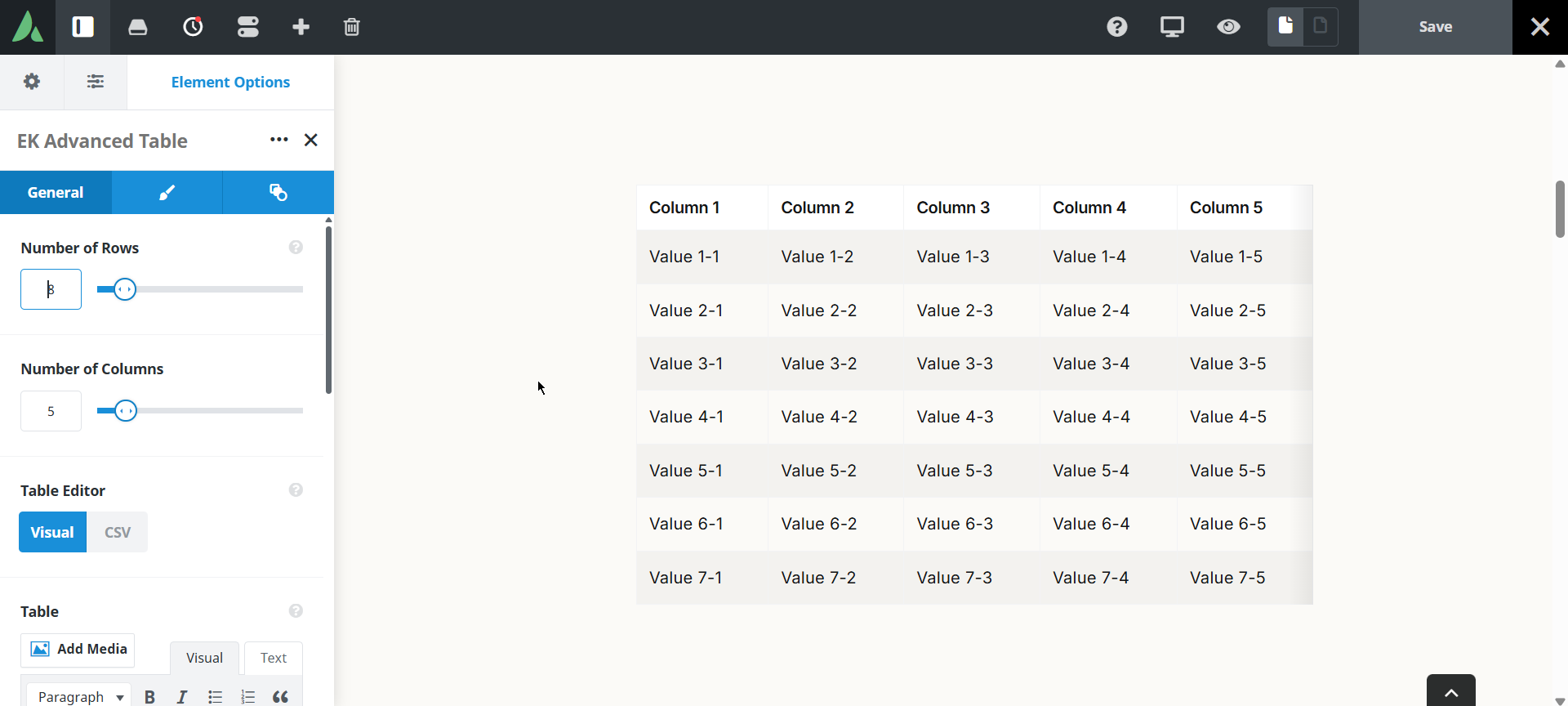
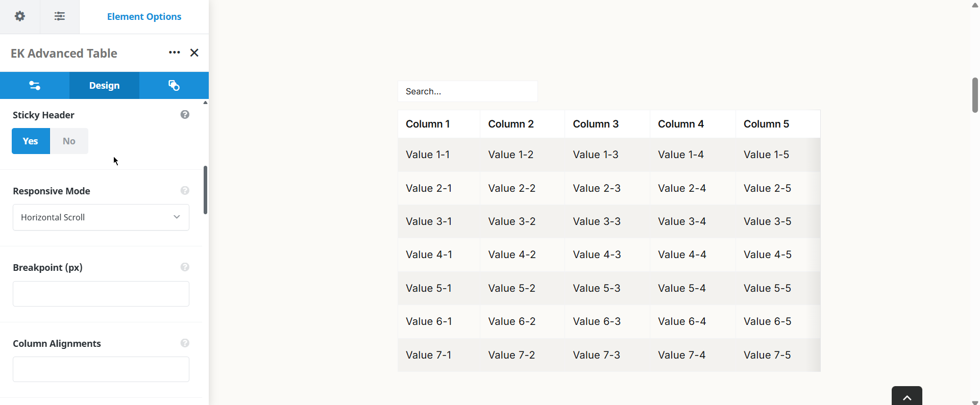
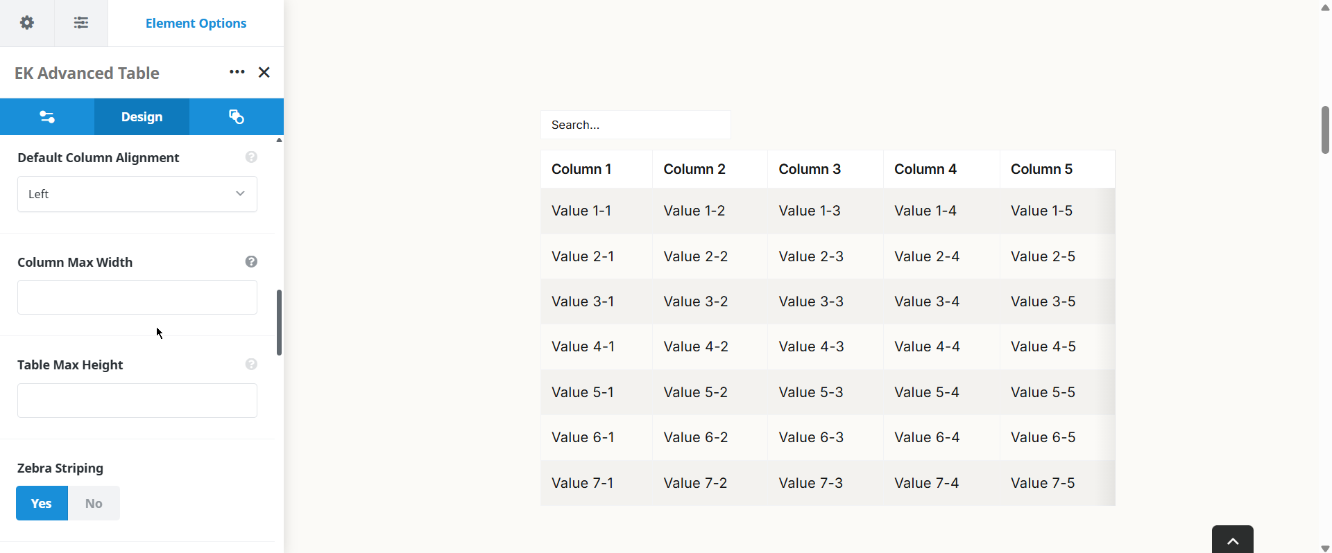
Settings reference
Every setting the element exposes, grouped by builder tab. Options are listed where the setting offers a fixed set of choices.
Table data General tab
Data entry mode
Visual grid · CSV
Visual grid gives a spreadsheet-style editor with row and column controls. CSV accepts pasted comma-separated text, which is faster for large data sets exported from a spreadsheet.
Table data
The cell content itself. A single instance holds up to 500 data rows.
Header row
On · Off
Marks the first row as a header. Header cells receive the header styling and are used as the field labels in stacked card mode.
Interactive controls General tab
Column sorting
On · Off
Lets visitors sort by clicking a column header. Sorting runs in the browser on the rows already loaded.
Live search
On · Off
Adds a search field above the table that filters rows as the visitor types.
Pagination
On · Off
Splits long tables into pages instead of one continuous list.
Rows per page
How many data rows appear on one page when pagination is on.
Sticky header
On · Off
Keeps the header row visible while the visitor scrolls a long table.
Row hover
On · Off
Highlights the row under the pointer, which helps when reading wide tables.
Zebra striping
On · Off
Alternates row background shading to keep the eye on one line.
Highlight row
Marks one row for emphasis, for example a recommended plan.
Highlight column
Marks one column for emphasis, for example the featured tier in a pricing matrix.
Responsive behaviour General tab
Responsive mode
Horizontal scroll · Stacked cards · Hide columns
Horizontal scroll keeps the table intact and scrolls sideways. Stacked cards turn each row into a labelled card and require a header row. Hide columns removes chosen columns below the breakpoint.
Breakpoint
The screen width at which the chosen responsive mode takes over.
Columns to hide
Which columns are dropped below the breakpoint when the hide columns mode is selected.
Design Design tab
Header colour
Background and text colour of the header row.
Highlight colour
Colour used for the highlighted row or column.
Hover colour
Row background colour shown under the pointer when row hover is on.
Column alignment
Left · Centre · Right
Text alignment, set per column, so numbers can sit right while labels sit left.
Column maximum width
An upper width limit per column, which stops one long text column from squeezing the rest.
Maximum height
Caps the height of the table and scrolls its body internally, which keeps a long table from dominating the page.
Margin
Per breakpoint
Outer spacing around the element, set separately for large, medium, and small screens and scoped to this element instance.
Padding
Per breakpoint
Inner spacing between the element container edge and its content, also set per breakpoint.
Extras Extras tab
Conditional Rendering
Avada logic conditions
Shows or hides the element based on logged-in state, user role, and the other conditions Avada’s logic system offers.
On this page
