
The kit
Elements [18]
EK Calendar
Parent / child element
Calendar
Displays a responsive grid of consecutive month or week blocks with date-specific entries, cache-safe today highlighting, optional navigation, and entry popups on hover, focus, or tap.
Dynamic Data
Entry date, title, details, link
Responsive columns
Shared helper, large / medium / small
Live Builder
Custom parent view
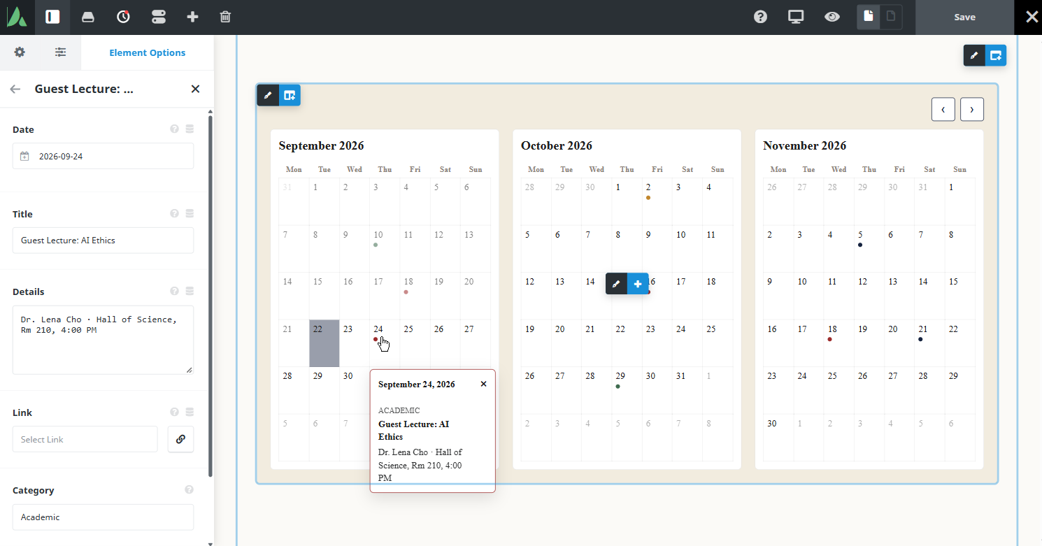
Multi-month layout with entry indicators and an open popup.
Example of calendar with month granularity…
October 2026
| Mon | Tue | Wed | Thu | Fri | Sat | Sun |
|---|---|---|---|---|---|---|
28 | 29 | 30 | 1 | 2 October 2, 2026
| 3 | 4 |
5 | 6 | 7 | 8 | 9 | 10 | 11 |
12 | 13 | 14 | 15 | 16 October 16, 2026
| 17 | 18 |
19 | 20 | 21 | 22 | 23 | 24 | 25 |
26 | 27 | 28 | 29 October 29, 2026
| 30 | 31 | 1 |
2 | 3 | 4 | 5 | 6 | 7 | 8 |
November 2026
| Mon | Tue | Wed | Thu | Fri | Sat | Sun |
|---|---|---|---|---|---|---|
26 | 27 | 28 | 29 | 30 | 31 | 1 |
2 | 3 | 4 | 5 November 5, 2026
| 6 | 7 | 8 |
9 | 10 | 11 | 12 | 13 | 14 | 15 |
16 | 17 | 18 November 18, 2026
| 19 | 20 | 21 November 21, 2026
| 22 |
23 | 24 | 25 | 26 | 27 | 28 | 29 |
30 | 1 | 2 | 3 | 4 | 5 | 6 |
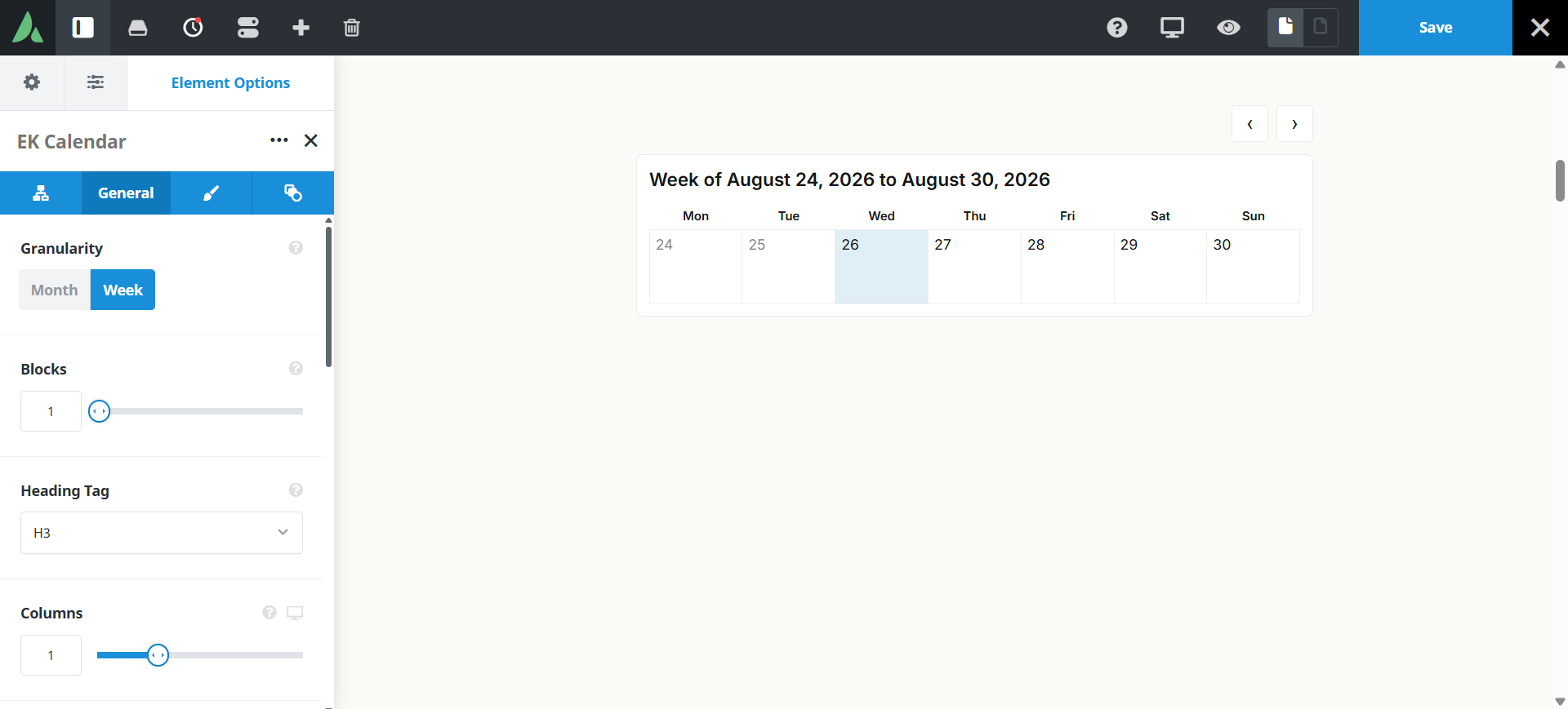
Example of calendar with week granularity…
Week of September 28, 2026 to October 4, 2026
| Mon | Tue | Wed | Thu | Fri | Sat | Sun |
|---|---|---|---|---|---|---|
28 | 29 | 30 | 1 | 2 October 2, 2026
| 3 | 4 |
Use cases
Key features
What the element does, in plain terms. Every individual control is listed in the settings reference below.
Structure
Month or week granularity
One calendar model for both. Week blocks can cross month boundaries, for example Jan 29 through Feb 4.
Configurable block count
Show multiple consecutive months or weeks inside one element.
Responsive grid columns
The shared columns helper controls how many blocks appear per row at large, medium, and small breakpoints.
Start mode
Choose the current period, in which today is computed client-side so that full-page caching cannot freeze yesterday’s highlight, or choose a fixed start date.
Timezone and locale
WordPress timezone, localized weekday and month names, and a configurable week start day.
Entries
Entry child elements
Each entry carries a specific date, title, details, and optional link. Popups open on hover, keyboard focus, and tap.
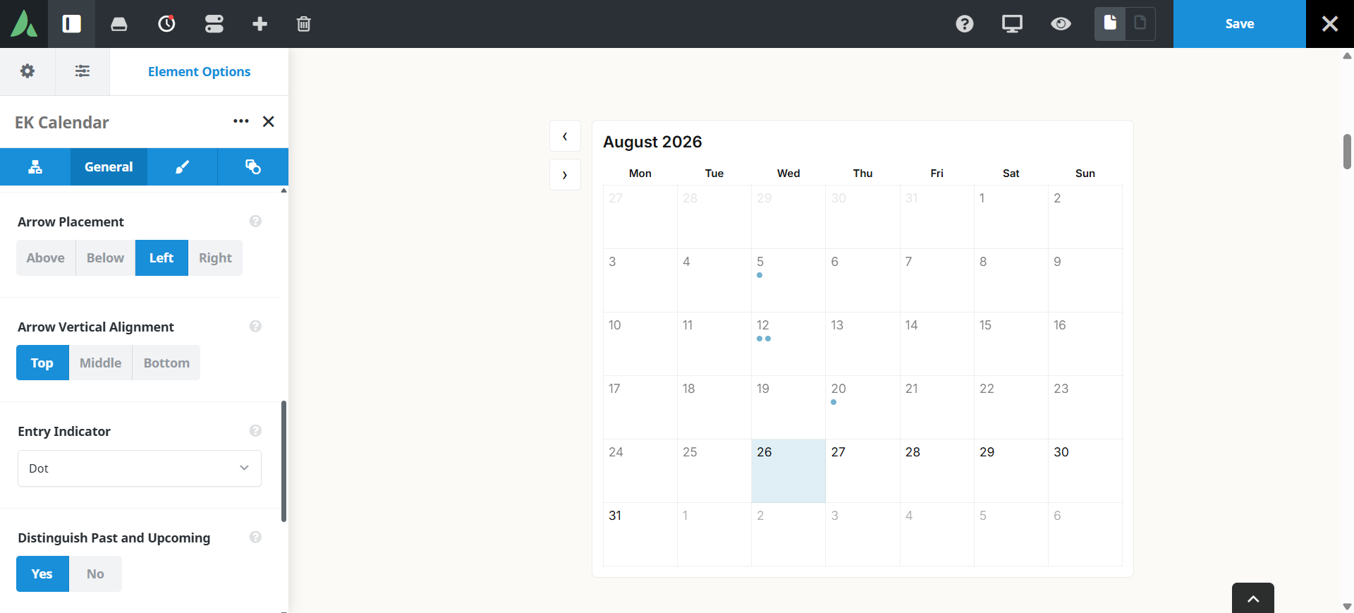
Entry indicators
Days with entries can show a dot, a count, or a full-cell highlight.
Past and upcoming styling
Optional past and upcoming labels. Past day cells can fade while entry popups stay fully opaque.
Dynamic Data
Available on entry date, title, details, and link fields.
Navigation and design
Navigation controls
Optional previous and next controls with a directional slide transition, and an instant swap under prefers-reduced-motion.
Shared arrow styling
Placement (including a vertical stack at the sides and below the grid), alignment, custom previous and next icons, colour, size, filled or outline, border, and radius. These are the same controls used by Timeline and Video Gallery.
Extensive colour and typography controls
Container, block, day, today, entry-day, weekday, day number, indicator, and popup styling are each addressable.
Configurable block heading tag
Consistent header typography across blocks, including the client-marked current block.
Responsive outer spacing
Margin and padding per breakpoint on the Design tab, scoped to this element instance.
Settings reference
Every setting the element exposes, grouped by builder tab. Options are listed where the setting offers a fixed set of choices.
Calendar structure General tab
Granularity
Month · Week
Sets what one block represents. Month renders a full calendar month with weekday headers. Week renders a single seven-day row, and a week block may cross a month boundary (for example Jan 29 through Feb 4). Both modes use the same calendar model, so entries and styling behave identically.
Number of blocks
How many consecutive months or weeks the element renders at once. Blocks always run in sequence from the starting period, so a value of three in month mode shows three consecutive months.
Start mode
Current period · Fixed start date
Current period begins at the visitor’s present month or week, and today is computed in the browser so a full-page cache cannot freeze yesterday’s highlight. Fixed start date pins the first block to a date you choose, which suits a published programme or season that should not move.
Fixed start date
The date the first block begins when start mode is set to fixed. In week mode the block starts on the week containing that date.
Week start day
Which weekday appears in the first column of every block, so the grid matches local convention.
Timezone and locale
Dates are evaluated against the WordPress site timezone, and weekday and month names are localized to the site language.
Block heading tag
h1 to h6, div, p, span
The markup tag used for each block title, so the calendar fits the page heading outline. Header typography stays consistent across blocks, including the block marked as current in the browser.
Layout and responsive columns General and Design tabs
Columns, large screens
Shared columns helper
How many blocks sit side by side on desktop widths. This is the same responsive columns helper used by Location Lister and Video Gallery.
Columns, medium screens
Blocks per row at Avada’s medium breakpoint, typically tablets. Set through Avada’s native responsive param mechanism.
Columns, small screens
Blocks per row at the small breakpoint. A single column keeps day cells large enough to tap on a phone.
Margin
Per breakpoint
Outer spacing above, below, and beside the calendar, scoped to this element instance so several calendars on one page do not collide.
Padding
Per breakpoint
Inner spacing between the calendar container edge and the block grid.
Entries Child element, one per entry
Entry date
Dynamic Data
The single date the entry belongs to. The entry appears on that day cell in any block that contains the date.
Entry title
Dynamic Data
The short label shown at the top of the entry popup.
Entry details
Dynamic Data
Supporting text under the title, for a time, a venue, or a one-line summary.
Entry link
Optional · Dynamic Data
A destination for the entry, shown as a link inside the popup. Leave it empty for entries that are informational only.
Entry indicator
Dot · Count · Highlight
How a day carrying entries is marked. Dot places a small marker in the cell, count shows the number of entries on that day, and highlight fills the whole cell.
Popup behaviour
Entry popups open on pointer hover, on keyboard focus, and on tap, so the same content is reachable with a mouse, a keyboard, or a touch screen.
Past and upcoming labels
Optional
Adds a past or upcoming label to entries relative to today. Past day cells can fade, while entry popups stay fully opaque so archived detail remains readable.
Navigation General and Design tabs
Show navigation
On · Off
Turns the previous and next controls on or off. With navigation off, the calendar shows only the configured block set.
Transition
Moving between block sets uses a directional slide. Visitors with prefers-reduced-motion get an instant swap instead, and the container height stays stable either way.
Arrow placement
Includes a vertical stack at the sides, and below the grid
Where the controls sit relative to the calendar.
Arrow alignment
How the pair of controls aligns within its placement, for example left, centre, or right when placed below the grid.
Previous and next icons
Custom Avada icons for each direction, so the controls can match the icon set used elsewhere on the site.
Arrow colour
Colour of the icon, and of the fill when the filled style is selected.
Arrow size
Icon size, which also sets the overall footprint of the control and its tap target.
Arrow style
Filled · Outline
Filled draws a solid button behind the icon, and outline draws the border only.
Arrow border width, style, and colour
The border drawn around each control, set independently of the icon colour.
Arrow border radius
Corner rounding of each control, from square through to a circle. These arrow settings match the controls on Timeline and Video Gallery.
Colour and typography Design tab
Container styling
Background and border treatment of the calendar as a whole, behind all blocks.
Block styling
Appearance of a single month or week block, including its header area.
Weekday header styling
Colour and typography of the localized weekday names in the top row of each block.
Day cell styling
Background and border of an ordinary day cell, which sets the base grid appearance.
Day number typography
Font controls for the date numeral inside each cell.
Today styling
The treatment applied to the current day, which is marked in the browser so caching cannot show a stale date.
Entry day styling
The treatment applied to any day that carries at least one entry.
Indicator styling
Colour and size of the dot, count, or highlight that marks days with entries.
Popup styling
Background, border, and typography of the entry popup, including its title, details, and link.
Block header typography
Font controls for block titles, applied consistently across blocks including the one marked as current.
Extras Extras tab
Conditional Rendering
Avada logic conditions
Shows or hides the element based on logged-in state, user role, and the other conditions Avada’s logic system offers.
On this page
