
The kit
Elements [18]
EK Timeline
Parent / child element
Semantic ordered list
Timeline
Presents an ordered vertical or horizontal timeline with dot, icon, or image markers, optional scroll-reveal animation, and rich typography controls.
Dynamic Data
Title, label, content, link, marker
Horizontal view
2 to 6 items visible
Marker size
Up to 100 pixels
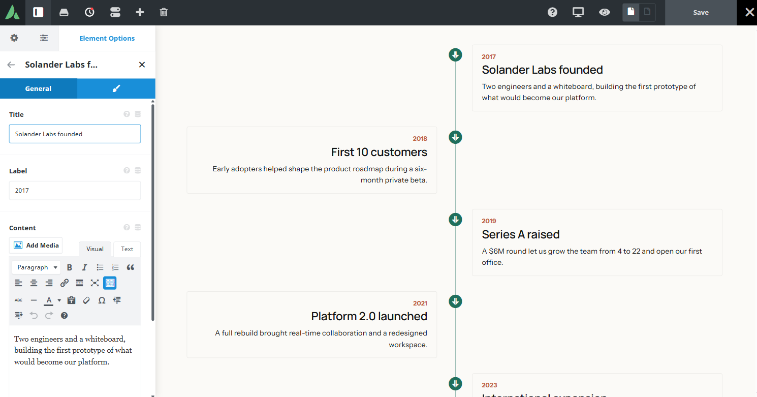
Centre mode collapses to a left-hand line on small screens.
Example of Vertical — Line Center, Alternate Sides Yes, Icon markers…
Example of Vertical — Line Left, Dot markers with border, Plain cards…
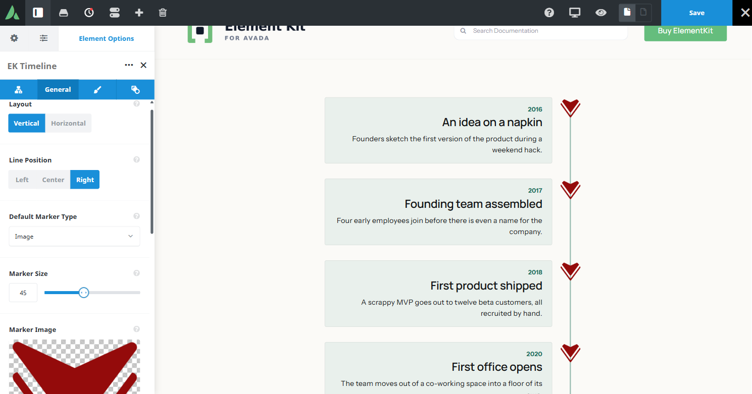
Example of Vertical — Line Right, Image markers…
- 2016
An idea on a napkin
Founders sketch the first version of the product during a weekend hack. - 2017
Founding team assembled
Four early employees join before there is even a name for the company. - 2018
First product shipped
A scrappy MVP goes out to twelve beta customers, all recruited by hand. - 2020
First office opens
The team moves out of a co-working space into a floor of its own. - 2022
50 people strong
Headcount crosses fifty, with hires now spread across three time zones.

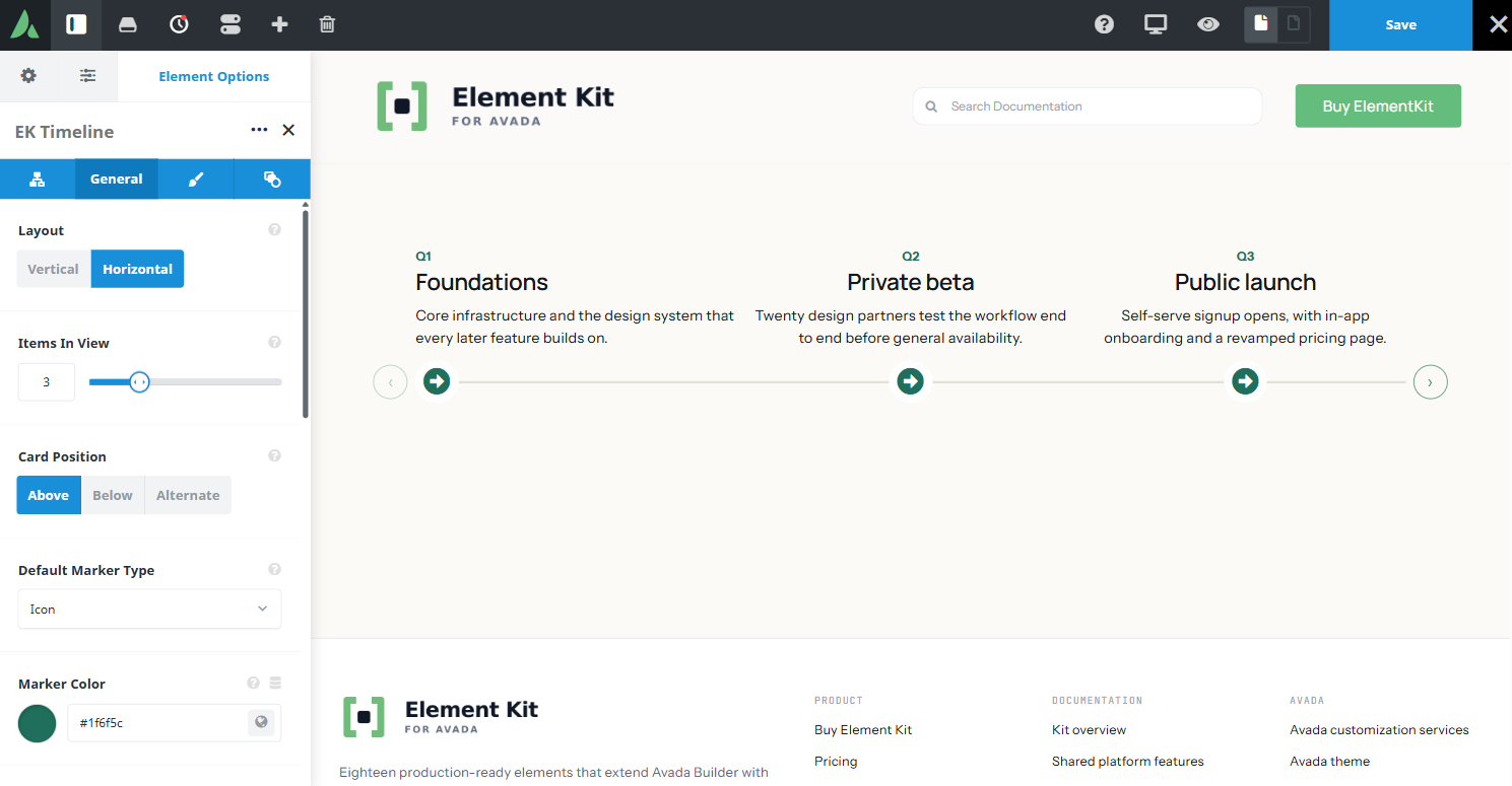
Example of Horizontal — Cards Above, Items In View 4, Outline arrows, Shadow cards…
Use cases
Key features
What the element does, in plain terms. Every individual control is listed in the settings reference below.
Layout
Vertical layout
The line sits left, right, or centre, with optional alternating cards. Centre mode collapses to a left line on small screens.
Horizontal layout
A shared scroll-snap carousel showing two to six items at a time, with cards above, below, or alternating relative to the line.
Items
Three marker types
A solid dot, an Avada icon, or an uploaded image rendered as an img element rather than inline SVG.
Per-item content
A title with a configurable heading tag, a free-text date or label, a rich text body, and an optional link. The marker type can override the parent default per item.
Motion and styling
Scroll-reveal animation
A fade or slide as items enter view, with stagger, disabled under prefers-reduced-motion.
Shared arrow styling
On horizontal layout: icon, colour, size, filled or outline, border, and radius, matching Calendar and Video Gallery.
Typography controls
Separate font controls for item titles and labels.
Responsive outer spacing
Margin and padding per breakpoint.
Settings reference
Every setting the element exposes, grouped by builder tab. Options are listed where the setting offers a fixed set of choices.
Structure General tab
Orientation
Vertical · Horizontal
Vertical suits history and process pages read top to bottom. Horizontal suits roadmaps scrolled sideways.
Line position
Left · Right · Centre
Where the vertical line sits. Centre mode collapses to a left line on small screens.
Alternating cards
On · Off
Places cards on alternating sides of a centre line. The alternation is visual only and does not change DOM order.
Items visible
2 to 6
How many cards the horizontal carousel shows at once.
Card position
Above · Below · Alternating
Where cards sit relative to the line in horizontal layout.
Marker size
Up to 100 pixels
The diameter of dot, icon, and image markers.
Default marker type
Dot · Icon · Image
The marker used by every item unless an item overrides it.
Timeline items Child element, one per item
Title
Dynamic Data
The milestone name shown at the top of the card.
Title heading tag
h1 to h6, div, p, span
The markup tag used for the title, so the timeline fits the page heading outline.
Date or label
Dynamic Data
Free text beside or above the title, for a date, a phase name, or a status.
Content
Rich text, Dynamic Data
The body of the item, which accepts formatted text and links.
Link
Dynamic Data
An optional destination for the item, rendered as a link in the card.
Marker override
Dot · Icon · Image
Uses a different marker for this item only. Uploaded SVG markers render as static images, so their stroke colour cannot be changed with CSS.
Animation General tab
Scroll reveal
Fade · Slide · Off
How items appear as they enter view. Animation is disabled under prefers-reduced-motion.
Stagger
The delay between consecutive items revealing, which creates a cascade rather than one block appearing.
Navigation arrow styling Design tab, shared with Calendar and Video Gallery
Arrow icon
Custom Avada icons
The icon used for the previous and next controls, set separately for each direction.
Arrow colour
Colour of the icon, and of the fill when the filled style is selected.
Arrow size
Icon size, which also sets the footprint of the control and its tap target.
Arrow style
Filled · Outline
Filled draws a solid button behind the icon. Outline draws the border only.
Arrow border width, style, and colour
The border around each control, set independently of the icon colour.
Arrow border radius
Corner rounding of each control, from square through to a circle.
Typography and spacing Design tab
Title typography
Font family, size, weight, and colour for item titles.
Label typography
Separate font controls for the date or label line.
Line and marker colours
Colour of the timeline line, markers, and marker borders.
Card styling
Background, border, and radius of item cards.
Margin
Per breakpoint
Outer spacing around the element, set separately for large, medium, and small screens and scoped to this element instance.
Padding
Per breakpoint
Inner spacing between the element container edge and its content, also set per breakpoint.
Extras Extras tab
Conditional Rendering
Avada logic conditions
Shows or hides the element based on logged-in state, user role, and the other conditions Avada’s logic system offers.
On this page
