
The kit
Elements [18]
EK Cost Calculator
Parent / child element
Display-only estimate
Cost Calculator
Provides a live price estimator where the site owner defines slider, dropdown, and checkbox fields and visitors see an instantly updating formatted total.
Dynamic Data
Symbol, disclaimer, CTA, labels
Grouping
Indian or Western
Accessibility
Server-rendered initial total
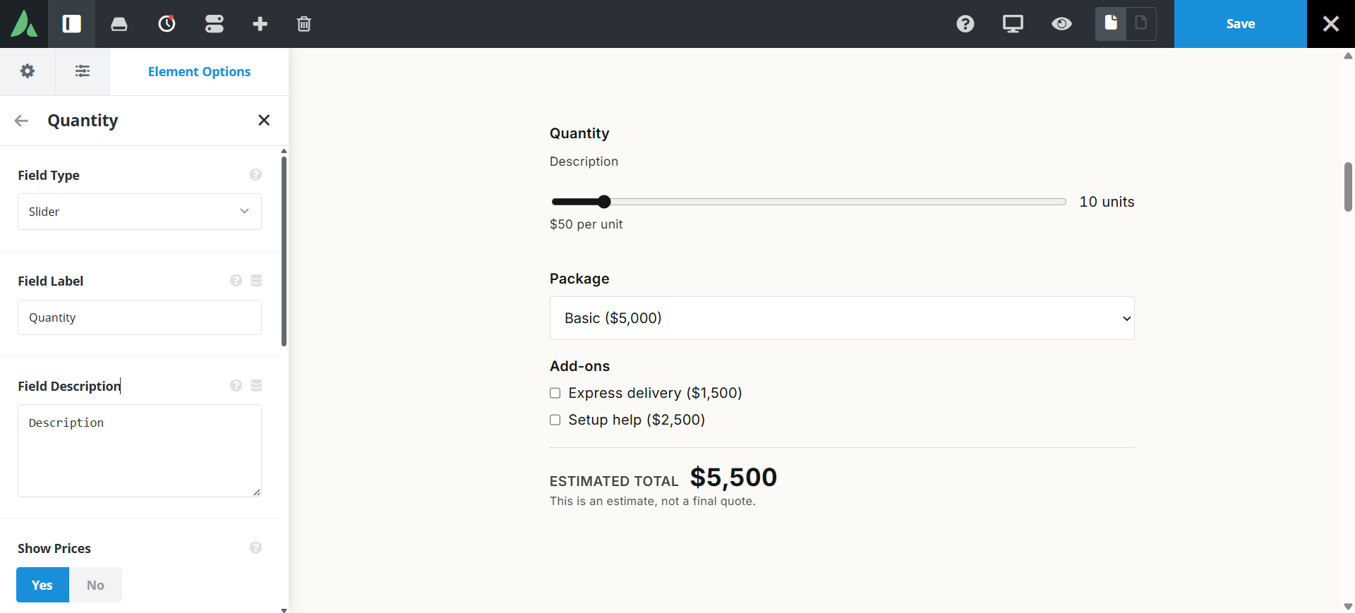
The initial total is rendered on the server before JavaScript loads.
Example of cost calculator with Field Slider, Dropdown and Checkboxes with sticky bottom…
Build Your Catering Estimate
Choose the level of catering service
Use cases
Key features
What the element does, in plain terms. Every individual control is listed in the settings reference below.
Fields
Three field types
A slider priced per unit, a single-select dropdown, and multi-select checkboxes. Each field is a child element in the builder.
Options repeater
A label, price, and preselect checkbox per option row in dropdown and checkbox fields.
Total
Currency formatting
Symbol, placement before or after the number, Indian grouping such as 1,00,000 or Western grouping such as 1,000,000, and zero to two decimal places.
Range messages
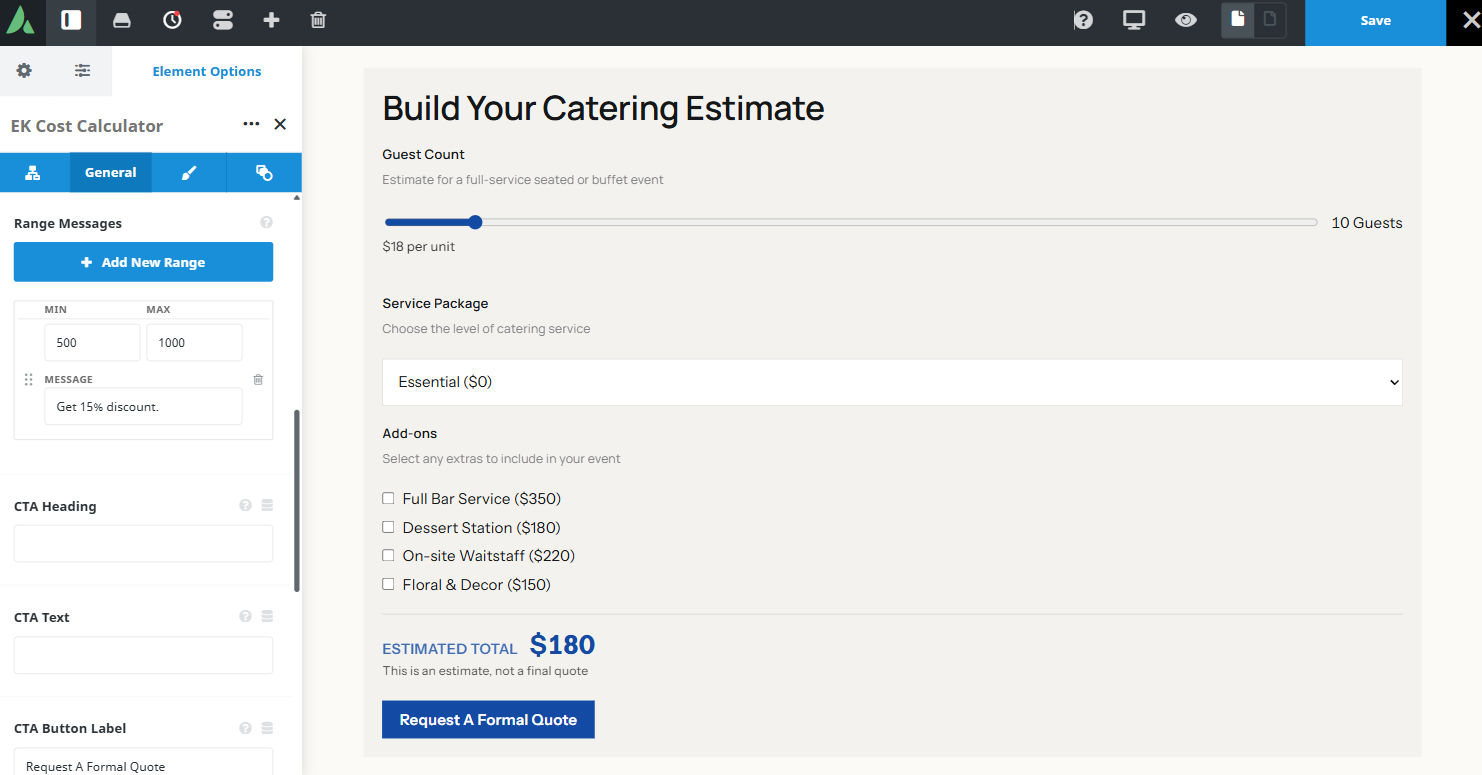
Tiered lines written as minimum, maximum, and message, shown under the total when the sum falls in that range.
Accessible total
The initial total is rendered on the server before JavaScript loads, and live updates are announced through an aria-live region.
Disclaimer
On by default, reading that this is an estimate and not a final quote.
Next step
Call-to-action block
A heading, body text, and a button that can link, open an Avada Modal, or open an Off Canvas panel using Avada’s native trigger markup.
Responsive outer spacing
Margin and padding per breakpoint.
Settings reference
Every setting the element exposes, grouped by builder tab. Options are listed where the setting offers a fixed set of choices.
Fields Child element, one per field
Field type
Slider · Dropdown · Checkboxes
Slider prices a quantity per unit. Dropdown offers one choice from a list. Checkboxes allow several add-ons at once.
Field label
Dynamic Data
The question or prompt shown above the control.
Slider minimum, maximum, and step
The range a visitor can choose and how finely they can move within it.
Price per unit
The amount added for each unit selected on a slider field.
Options repeater
Label, price, preselect
The choices in a dropdown or checkbox field, each with its own price and an optional preselected state.
Total and currency General tab
Currency symbol
Dynamic Data
The symbol shown with the total.
Symbol placement
Before · After
Whether the symbol leads or trails the number.
Digit grouping
Indian · Western
Indian grouping renders 1,00,000. Western grouping renders 1,00,000 as 100,000.
Decimal places
0 to 2
How precisely the total is shown. Zero suits whole-currency estimates.
Range messages
Minimum | maximum | message
Tiered lines shown under the total when the sum falls inside a range, for example a free shipping threshold.
Disclaimer
On by default
A line under the total making clear the figure is an estimate rather than a final quote.
Call to action General tab
CTA heading
Dynamic Data
The heading of the block under the total.
CTA body text
Dynamic Data
A short paragraph explaining the next step.
Button text
Dynamic Data
The label on the action button.
Button action
Link · Avada Modal · Off Canvas
Where the button leads, using Avada’s native trigger markup for the modal and off canvas options.
Design Design tab
Field styling
Appearance of labels, sliders, dropdowns, and checkboxes.
Total styling
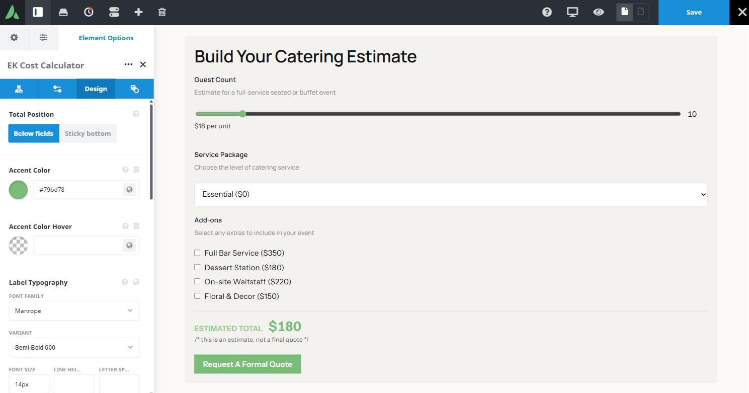
Typography and colour of the running total, which is usually the largest element in the block.
Accent colour
Colour used on the slider track, active states, and the action button.
Margin
Per breakpoint
Outer spacing around the element, set separately for large, medium, and small screens and scoped to this element instance.
Padding
Per breakpoint
Inner spacing between the element container edge and its content, also set per breakpoint.
Extras Extras tab
Conditional Rendering
Avada logic conditions
Shows or hides the element based on logged-in state, user role, and the other conditions Avada’s logic system offers.
On this page
