
The kit
Elements [18]
EK Text Mask
Real heading markup
Reduced-motion aware
Text Mask
Renders large real heading text with a photograph or gradient visible through the letterforms using CSS background clipping, with optional scroll-based parallax.
Dynamic Data
Mask image and gradient fields
Fallback
Solid colour outside @supports
Motion
Transform-based parallax
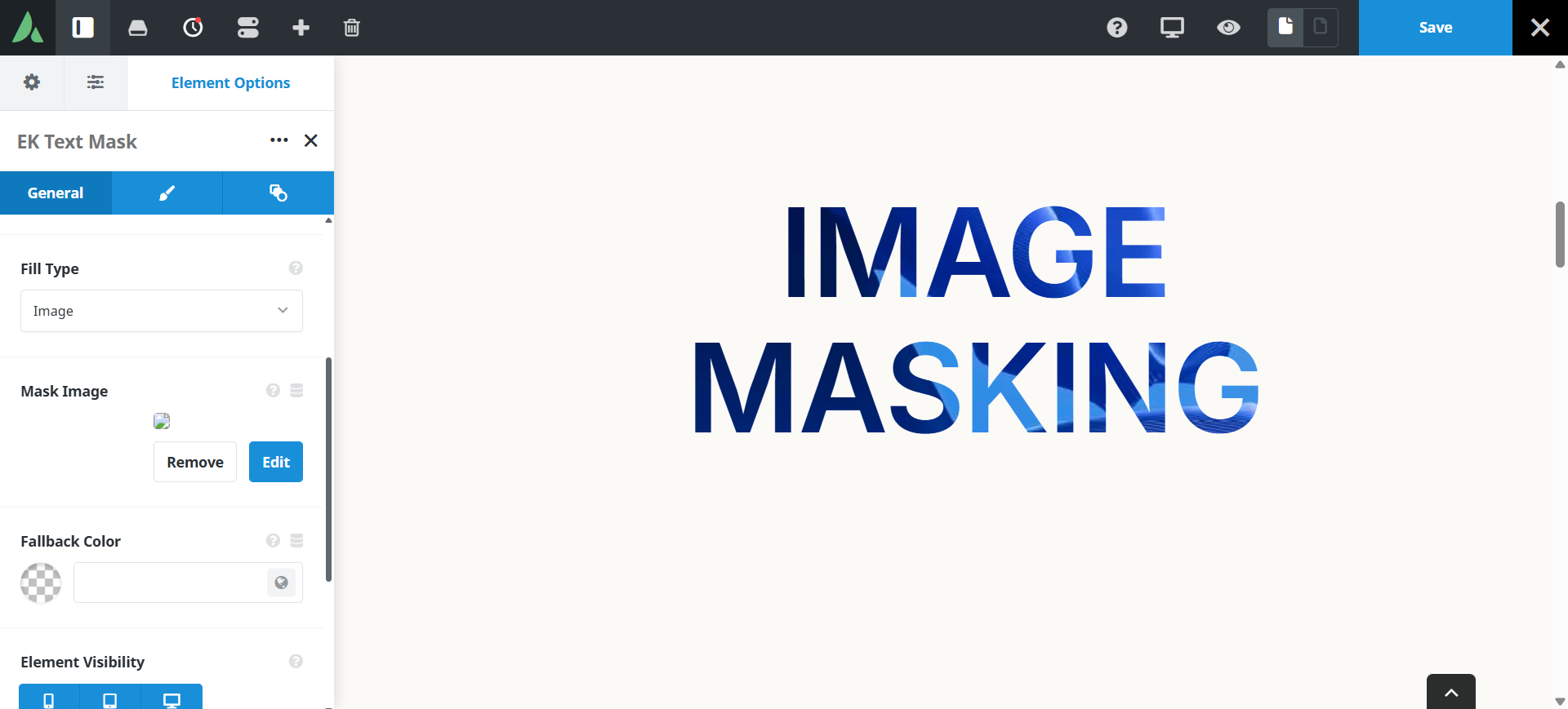
The text remains real, crawlable heading markup.
Example of text masking with image…
Cities
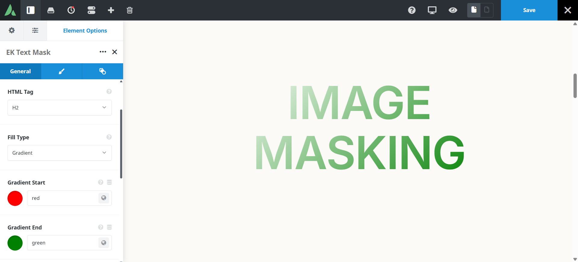
Example of text masking with Gradient colours…
Text Mask
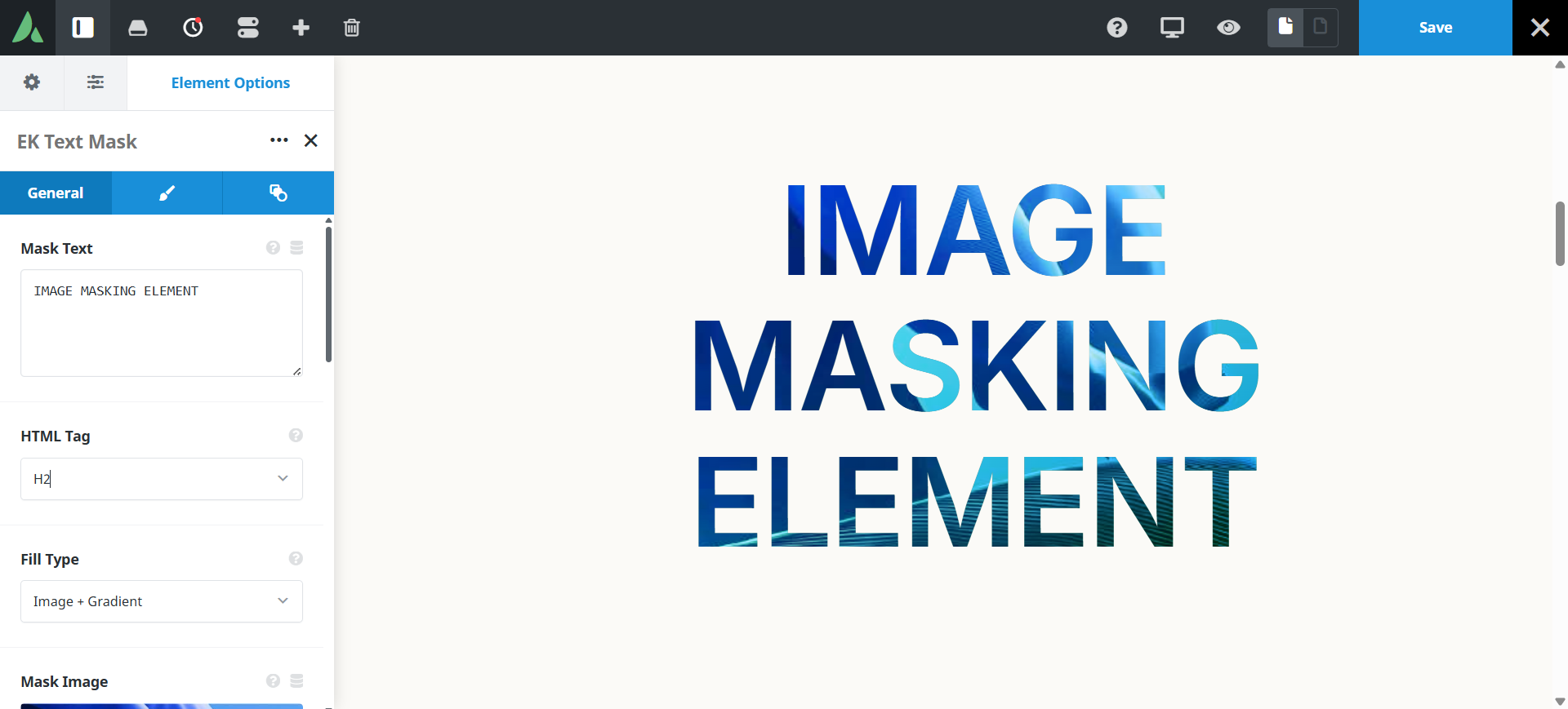
Example of text masking with image and Gradient colours…
IMAGE MASKING
Use cases
Key features
What the element does, in plain terms. Every individual control is listed in the settings reference below.
Fill
Three fill types
Image only, CSS gradient only, or image plus gradient with a blend mode control.
Solid fallback colour
Shown where background-clip is unsupported, and when the image is missing.
Type and motion
Responsive typography
Font size through clamp, viewport width, or fixed pixels, plus weight, family, transform, and alignment controls.
Transform-based parallax
Scroll-linked motion without a fixed background attachment, disabled automatically under prefers-reduced-motion.
Responsive outer spacing
Margin and padding per breakpoint.
Settings reference
Every setting the element exposes, grouped by builder tab. Options are listed where the setting offers a fixed set of choices.
Content General tab
Heading text
The words shown. The element outputs real heading markup, so the text stays selectable and crawlable.
Heading tag
h1 to h6, div, p, span
The markup tag used, so the headline fits the page outline. Use only one h1 per page.
Fill General and Design tabs
Fill type
Image · Gradient · Image plus gradient
Image clips a photograph through the letters. Gradient clips a CSS gradient. The combined mode layers both, which lifts contrast on busy photographs.
Mask image
Dynamic Data
The photograph shown through the letterforms. Keep source files reasonably small, roughly under 400 KB.
Gradient colours and angle
Dynamic Data
The gradient used on its own or over the image.
Blend mode
How the gradient combines with the image in the combined fill mode.
Fallback colour
A solid colour used where background clipping is unsupported or the image fails to load.
Typography Design tab
Font size mode
Clamp · Viewport width · Fixed pixels
Clamp scales between a minimum and maximum. Viewport width scales continuously. Fixed pixels holds one size at every breakpoint.
Font family, weight, and transform
Standard Avada font controls. Heavier weights show more of the image, and very thin type shows almost none.
Text alignment
Left · Centre · Right
Horizontal placement of the headline within its column.
Line height and letter spacing
Fine control over how tightly the letterforms sit, which affects how much image is visible.
Motion and spacing Design tab
Parallax
On · Off
Moves the fill as the visitor scrolls, using transforms rather than a fixed background. It is switched off automatically under prefers-reduced-motion.
Parallax intensity
How far the fill travels across the scroll range.
Margin
Per breakpoint
Outer spacing around the element, set separately for large, medium, and small screens and scoped to this element instance.
Padding
Per breakpoint
Inner spacing between the element container edge and its content, also set per breakpoint.
Extras Extras tab
Conditional Rendering
Avada logic conditions
Shows or hides the element based on logged-in state, user role, and the other conditions Avada’s logic system offers.
On this page
