
The kit
Elements [18]
EK Video Gallery
Parent / child element
Zero iframes on load
Video Gallery
Displays YouTube, Vimeo, or self-hosted videos behind click-to-play facades in grid, thumbnail slider, or playlist layouts, loading zero video iframes until the visitor chooses to play.
Dynamic Data
Per video item fields
Grid columns
2 to 6, per breakpoint
Privacy
Avada Privacy Consent aware
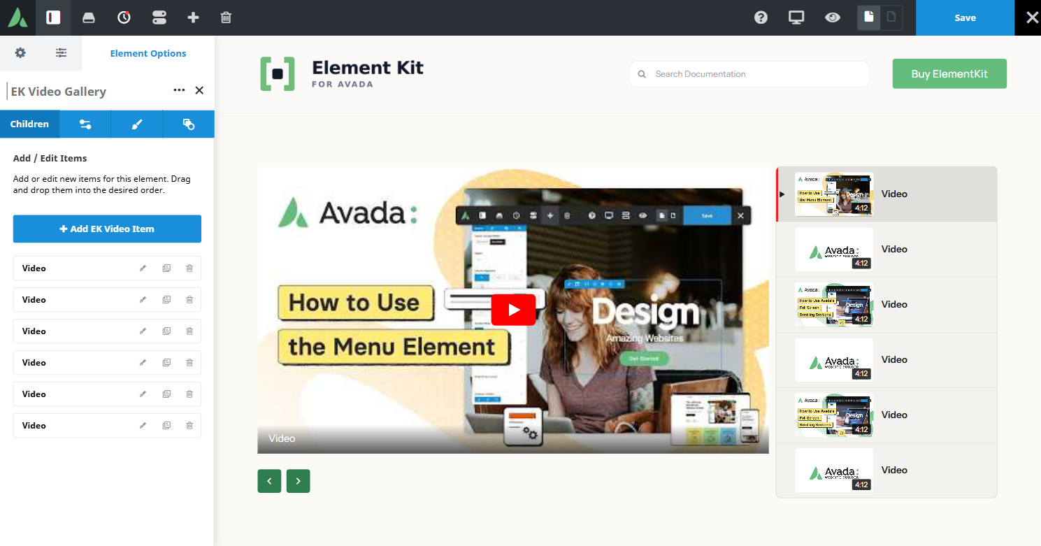
Only one video plays at a time across all instances on the page.
Example of video gallery with with a YouTube-style playlist…
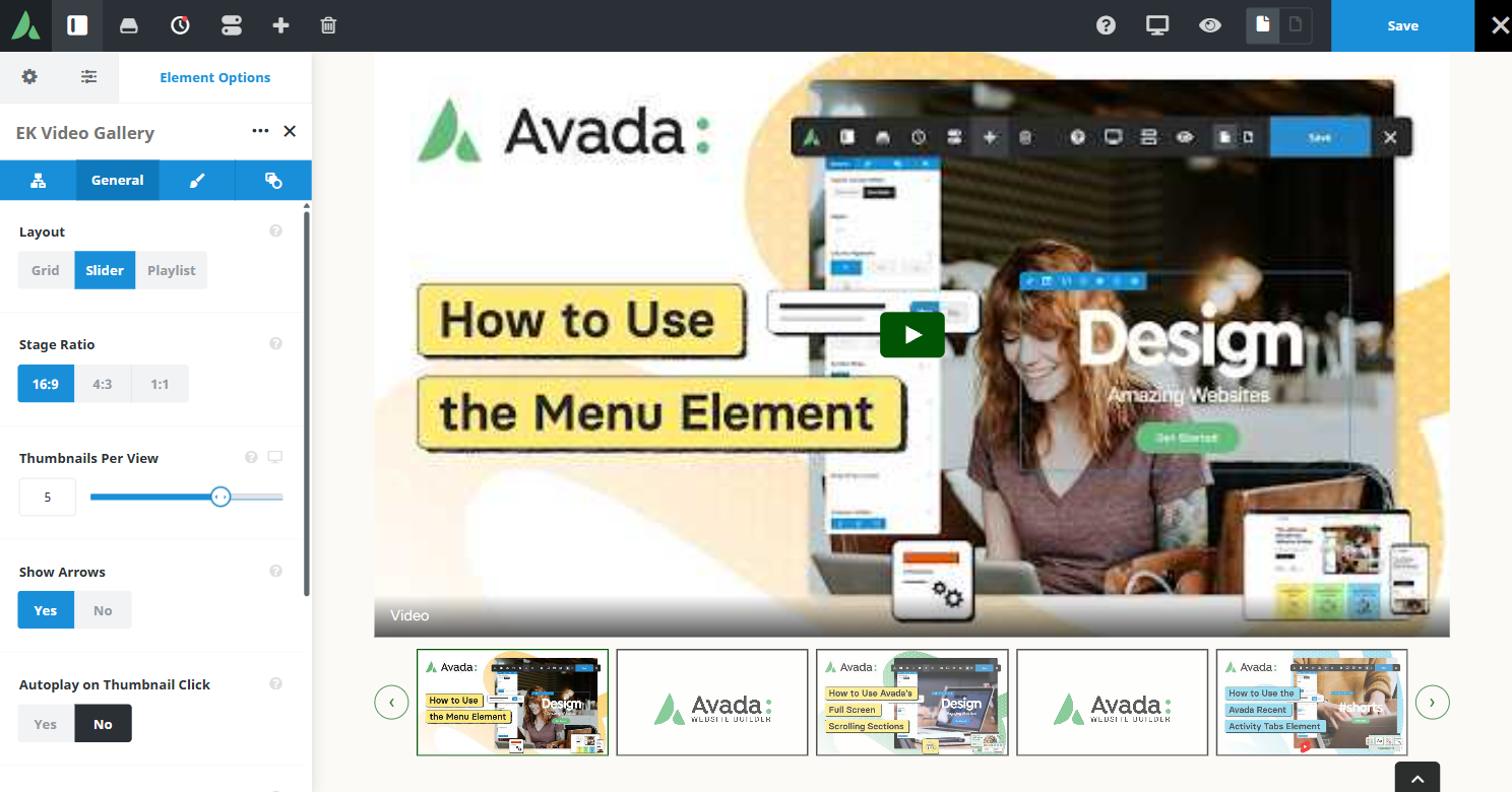
Example of video gallery with layout slider…
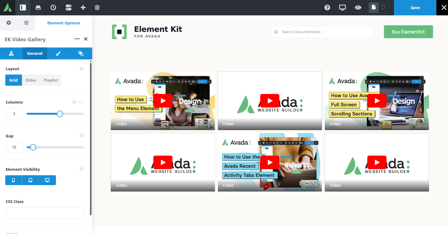
Example of video gallery with layout grid…
Use cases
Key features
What the element does, in plain terms. Every individual control is listed in the settings reference below.
Performance and privacy
Click-to-play facades
No iframe is created until the visitor clicks. YouTube uses the privacy-enhanced nocookie domain, and only one video plays at a time across all instances on the page.
Avada Privacy Consent integration
When that Avada feature is enabled site-wide, the embed stays blocked until the visitor accepts the site privacy settings.
Layout
Three layouts
A responsive column grid, a scroll-snap thumbnail slider, and a playlist with a main stage plus a scrollable item list.
Playlist options
List position left or right, mobile stacked or a collapsible up-next bar, optional previous and next controls, and an optional maximum list height with contained scrolling.
Sources and styling
Video sources
A YouTube URL, a Vimeo URL, or a self-hosted file, with a custom thumbnail upload, an automatic YouTube thumbnail, or a Vimeo oEmbed thumbnail cached for 30 days.
Static duration field
An owner-entered badge on playlist items. Vimeo and self-hosted sources can prefill it when metadata is available. YouTube duration is not fetched.
Shared navigation arrow styling
Icon, colour, size, filled or outline style, border width, style, and colour, and border radius, aligned with Calendar and Timeline.
Title typography and overlay
Font controls plus an overlay background colour, each with a hover companion, on grid and slider tiles.
Settings reference
Every setting the element exposes, grouped by builder tab. Options are listed where the setting offers a fixed set of choices.
Layout General tab
Layout
Grid · Thumbnail slider · Playlist
Grid lays every video out as an equal tile. Thumbnail slider scrolls a single row with snap points. Playlist pairs one main stage with a list of the remaining videos.
Columns, large / medium / small
2 to 6 per breakpoint
Tiles per row in grid layout, set for each breakpoint through the shared responsive columns helper.
Thumbnails per view
Per breakpoint
How many thumbnails the slider shows at once. The slider uses its own counts rather than the shared columns helper.
Playlist list position
Left · Right
Which side of the main stage the item list sits on at desktop widths.
Playlist mobile behaviour
Stacked · Collapsible up-next bar
Stacked places the list under the stage. The collapsible bar keeps the stage in view and opens the list on demand.
Previous and next controls
On · Off
Adds controls that step through playlist items without opening the list.
Item list maximum height
Caps the height of the playlist list and scrolls it internally, so a long list does not stretch the section.
Video items Child element, one per video
Video source
YouTube · Vimeo · Self-hosted
Where the video comes from. YouTube embeds use the nocookie domain.
Video URL or file
Dynamic Data
The YouTube or Vimeo address, or the self-hosted media file.
Title
Dynamic Data
The label shown on the facade tile and in the playlist row.
Thumbnail
Custom · Automatic · Vimeo oEmbed
A custom upload, the automatic YouTube thumbnail, or a Vimeo oEmbed thumbnail cached for 30 days. Self-hosted videos work best with a custom image.
Duration
Static text
A badge on the playlist row. It is a static label, not a live countdown, and YouTube durations are never fetched automatically.
Navigation arrow styling Design tab, shared with Timeline and Calendar
Arrow icon
Custom Avada icons
The icon used for the previous and next controls, set separately for each direction.
Arrow colour
Colour of the icon, and of the fill when the filled style is selected.
Arrow size
Icon size, which also sets the footprint of the control and its tap target.
Arrow style
Filled · Outline
Filled draws a solid button behind the icon. Outline draws the border only.
Arrow border width, style, and colour
The border around each control, set independently of the icon colour.
Arrow border radius
Corner rounding of each control, from square through to a circle.
Typography and colour Design tab
Title typography
Font family, size, weight, and colour for tile and row titles, with a hover companion.
Overlay background colour
Colour of the gradient or panel behind title text on grid and slider tiles, with a hover companion.
Play button styling
Appearance of the play affordance on each facade.
Margin
Per breakpoint
Outer spacing around the element, set separately for large, medium, and small screens and scoped to this element instance.
Padding
Per breakpoint
Inner spacing between the element container edge and its content, also set per breakpoint.
Extras Extras tab
Conditional Rendering
Avada logic conditions
Shows or hides the element based on logged-in state, user role, and the other conditions Avada’s logic system offers.
On this page
