
The kit
Elements [18]
EK Simple Filterable Gallery
Parent / child element
Built-in lightbox
Simple Filterable Gallery
Builds a group-based image gallery with category filter buttons, a CSS grid or masonry layout, and a minimal built-in lightbox, without requiring a portfolio custom post type.
Dynamic Data
Gallery group images
Columns
2 to 6, per breakpoint
Dependencies
No Isotope, no iLightbox
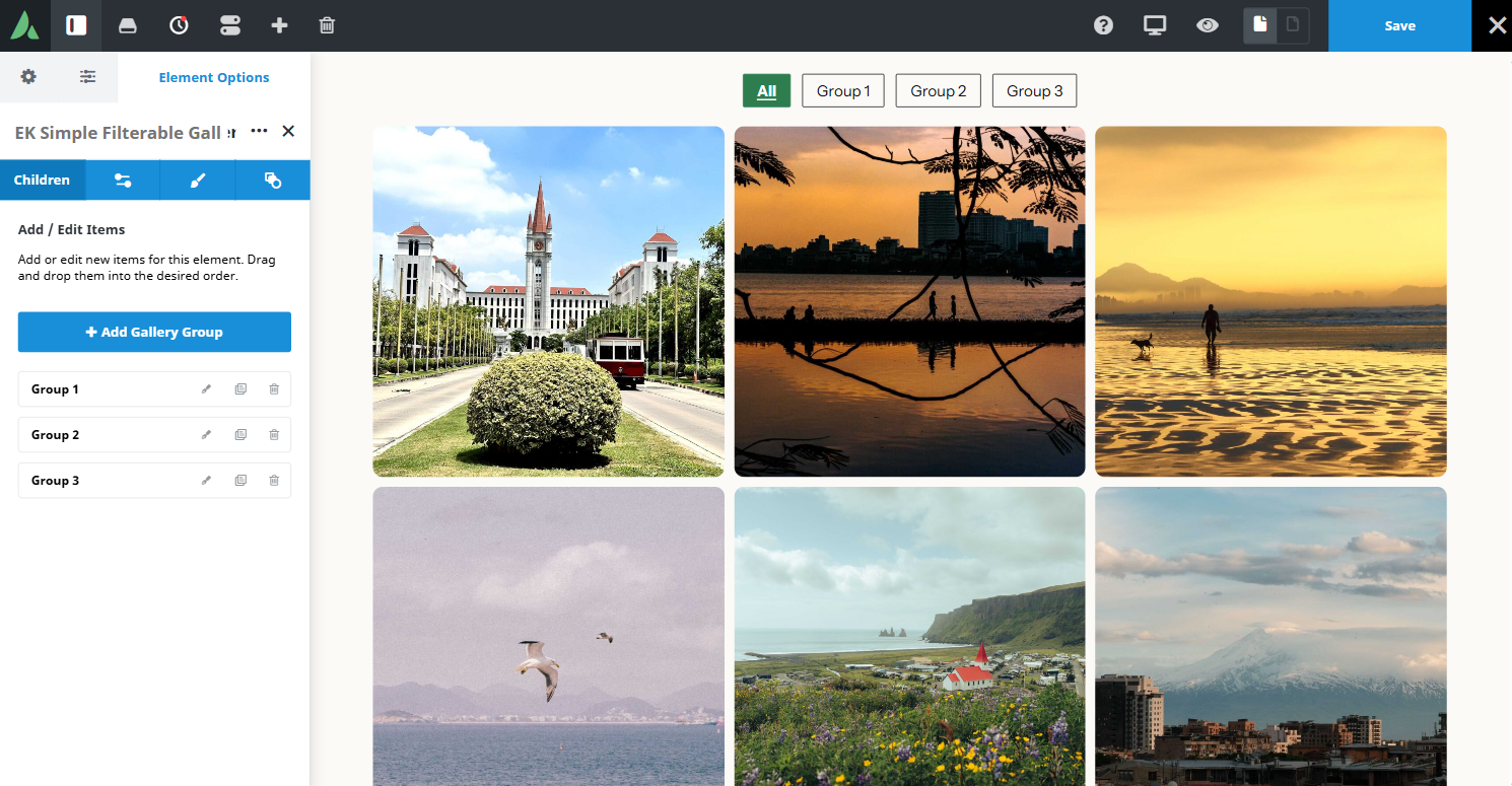
Filter buttons are generated from the gallery group titles.
Example of simple filterable gallery with filter…
Where the mountains meet the sea A city beneath the mountains A timeless landmark beneath blue skies Golden moments by the water A peaceful evening by the lake Wings over the open sea
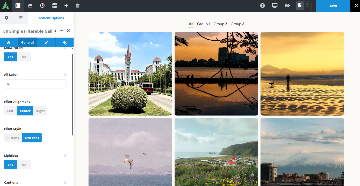
Example of simple filterable gallery with Different tabs and layout design…
A city beneath the mountains Where the mountains meet the sea A timeless landmark beneath blue skies Golden moments by the water A peaceful evening by the lake Wings over the open sea
Use cases
Key features
What the element does, in plain terms. Every individual control is listed in the settings reference below.
Content
Gallery groups
Each group has a title and a multi-image upload. Filter buttons are generated from the group titles, with an All tab added automatically.
Caption modes
No captions, a hover overlay, or a caption below the image using the WordPress attachment caption.
Layout
Grid or masonry layout
Filtering is CSS-only with no Isotope dependency. Masonry flows top to bottom within each column.
Responsive columns
Two to six columns with separate large, medium, and small values. Medium and small default to automatic collapse.
Viewing
Built-in lightbox
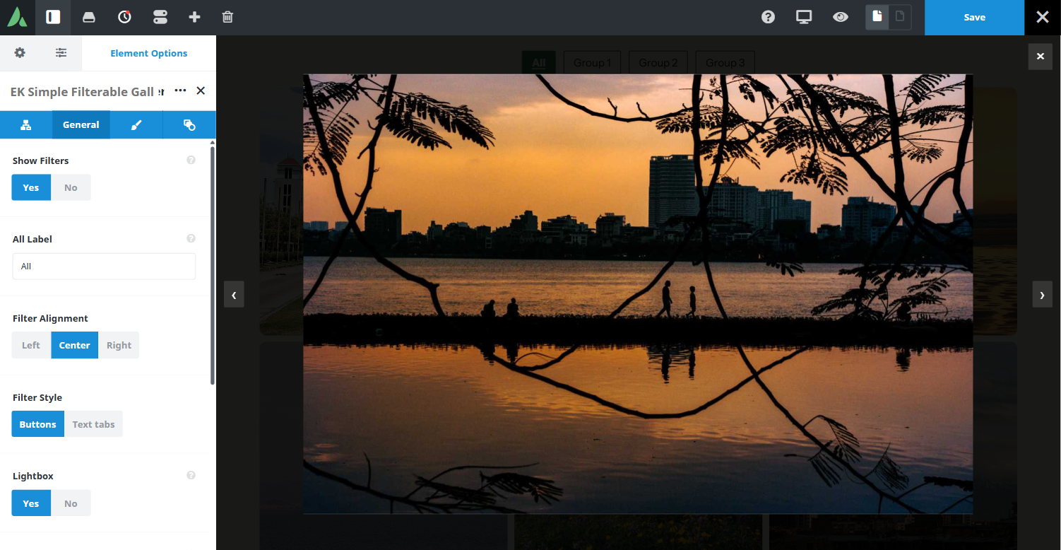
Previous and next move within the active filter only, focus is trapped while open, and Escape closes it. No Avada iLightbox dependency.
Design extras
Hover effect type, image borders and radius, caption typography, and overlay colour.
Settings reference
Every setting the element exposes, grouped by builder tab. Options are listed where the setting offers a fixed set of choices.
Gallery groups Child element, one per group
Group title
The label used for this group and for its filter button. An All tab is always generated in addition to the group titles.
Group images
Dynamic Data
The images in this group, added through a multi-image upload. An image that belongs to two categories must be added to both groups.
Layout General tab
Layout
Grid · Masonry
Grid crops tiles to a consistent shape for an even rhythm. Masonry keeps natural image heights and flows top to bottom per column.
Columns, large screens
2 to 6
Tiles per row on desktop widths.
Columns, medium screens
2 to 6, automatic by default
Tiles per row at the medium breakpoint. The default collapses automatically from the large value.
Columns, small screens
2 to 6, automatic by default
Tiles per row on phones, where two columns usually reads best.
Image aspect ratio
The crop applied to grid tiles. Masonry ignores this setting and uses natural image heights.
Filter bar
On · Off
Shows or hides the generated filter buttons, for a gallery that only needs one set of images.
Captions General and Design tabs
Caption mode
None · Hover overlay · Below image
Where the WordPress attachment caption appears, or whether it appears at all.
Caption typography
Font family, size, weight, and colour for captions.
Overlay colour
Background colour of the hover overlay behind caption text.
Interaction and design Design tab
Lightbox
On · Off
Opens the full image in the built-in lightbox on click, cycling only through the currently filtered images.
Hover effect type
The effect applied to a tile under the pointer, for example a zoom or a fade.
Image border and radius
Border width, colour, and corner rounding on each tile.
Margin
Per breakpoint
Outer spacing around the element, set separately for large, medium, and small screens and scoped to this element instance.
Padding
Per breakpoint
Inner spacing between the element container edge and its content, also set per breakpoint.
Extras Extras tab
Conditional Rendering
Avada logic conditions
Shows or hides the element based on logged-in state, user role, and the other conditions Avada’s logic system offers.
On this page
